By Lila Quintero Weaver
We’re continuing a fascinating conversation with acclaimed illustrator Joe Cepeda. His work graces many Latin@-themed children’s books. Did you miss the first installment? Go here.
Lila: When did your interest in art begin? How did you train for a career in illustration?
Joe: When I was young, I enjoyed drawing enough that my mom enrolled me at the Los Angeles Music and Art School in East Los Angeles, a small jewel of a place where I first tried painting. By my teens, though, I stopped going and after graduating high school found myself headed to college to study engineering. It took me awhile before I changed all of that. Initially, I thought I’d be an editorial cartoonist, but as soon as I got a brush back in my hand, I realized I wanted to do something that had an artfulness to it as well. Illustration afforded the perfect combination of content and creative articulation for me.
To be honest, my training was largely guided toward editorial work. I sort of fell into children’s books. Creating a piece for a magazine article is much like doing work for a cover. There is a certain amount of seduction employed in influencing a magazine reader to stop and read an article, much the way you’d want someone to pick up a book off a shelf. A combination of abstraction, mystery, emotion, and information might play a role in creating that single image that will lure the audience in.
From the books I’ve illustrated, I pretty much taught myself sequential image-making and continue to do that. With a portfolio largely lacking any real samples that reflected page-turning sensibilities, it was very fortunate that I was signed up to illustrate those first books. I believe that it was an inclination to write a picture as much as illustrate one that may have been evident to my first editors and art directors. They seem to have responded to that and took a risk. I’m grateful to them for doing so.
Lila: Most of us have no idea how an illustrator goes about his work. Can you give us a tour of the process?
Joe: In many ways, the real work is done throughout the sketch phase. For editorial work, I usually create a few alternate ideas for a director to choose from. The sketches need to be tight enough for the director to envision the finished art.
For books, the sketch process is more comprehensive. The first sketches are thumbnails in which I mostly brainstorm, trying to find the basic rhythm, character introduction, action, choreography of the story, etc. The second phase of sketches, laid out as a dummy (a design/template that allows you to see the whole book planned out) focuses on the essential content of the story, as well as soundly composing the images. This is the working plan to be shared with editors and art directors. It’s important to understand that this design is as much for others as it is for oneself. This is where mistakes are caught.
Finally, in the last draft of sketches, details are included to a more specific degree. The emotions of your images many times are expressed in the details of your illustrations. It’s where things become funny, scary, thrilling, suspenseful, etc. This shouldn’t be confused with complexity—a simple picture has as much power as an ornate one. Once the dummy is okayed, it’s on to the finished work. Almost all of my books have been executed as oil paintings over acrylic under-paintings on illustration board. A recent book I illustrated was delivered as digitally rendered finishes. Whatever your medium of choice, the more confident you are of your plan, the more enjoyable the last part of the process will be. I leave color out of the initial plans because I prefer to be responsive when it comes to that, leaving a level of spontaneity for the end.
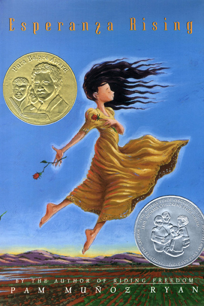
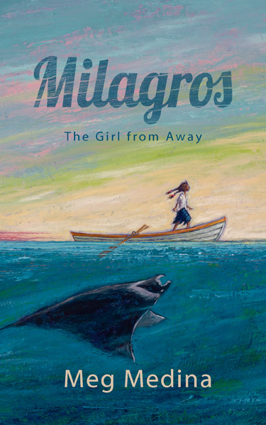 Lila: Let’s close out this conversation by returning to a book cover, the one you recently did for the e-book version of Meg Medina’s Milagros: A Girl from Away. It’s breathtaking, truly exceptional. I know Meg was thrilled with it!
Joe: Thanks for the kind words. Milagros is a great story and it was a wonderful opportunity to illustrate the cover of the e-book. After reading the manuscript, I couldn’t help responding to Milagros as a girl between two worlds. It’s the “between” part that intrigued me as a source for creating a provocative image. Milagros is not only traveling from one place to another, as she does in the story, she’s also between the clarity of a wide-open sky and the deep mystery and profundity of the ocean. The magical realism of the story, in my mind, calls for a more symbolic and open-ended image. Alternative ideas depicted Milagros closer to the viewer, larger in the design. This would emphasize Milagros more. A reader might respond to that kind of image, “That girl looks like me, i want to read about her.” It’s certainly popular to create covers that are more character-based, but, I’m glad that we decided to go the other way, that is, emphasizing the mystery, the peril of the journey, and the hopefulness and optimism of Milagros’ spirit. A reader here might ask, “Where is that girl going? What is she facing? Is she lost? Is she on her way somewhere? Is she safe? Will she get there? What will she find? Keeping her small in the design also helps the reader ask, “Who is she?” My first sketches didn’t include the manta ray, inclined to depict Milagros navigating her way alone, but, as we discussed, it’s a central part of the story. I’m glad mantas are such mysterious and, perhaps, very poetic creatures. I wanted it to have an ambiguous posture… is it a threat to her, or is it a witness, or, even something more? For me, the more questions you ask when looking at a cover, the better a cover does its job.
“““““““`
To learn more about Joe’s craftsmanship and illustration technique, see this extensive interview by Kathleen Temean.
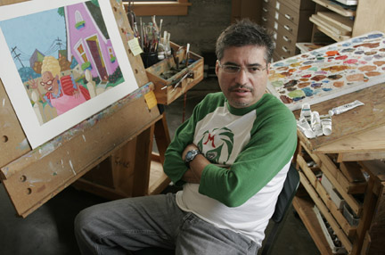
Want to see Joe in his studio and hear more of his story? Here’s a video interview, worth the double click-through!